The Psychology Of Color In Presentation Design


Color plays a crucial role in presentation design, influencing emotions, perceptions, and audience engagement.
Choosing the right colors can help reinforce your message, enhance comprehension, and leave a lasting impression.
Understanding the psychology behind colors allows presenters to use them strategically to evoke the right emotions and improve communication.
Harness the power of color to craft engaging and unforgettable presentations that connect with your audience on a deeper level.
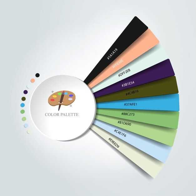
The Meaning Behind Colors
1. Red – Energy and Urgency
Red is a powerful color associated with passion, excitement, and urgency. It grabs attention and stimulates action. In presentations, red can highlight critical points, emphasize urgency, or create a sense of urgency in sales and marketing pitches.
Best Uses:
- Call-to-action elements
- Important statistics or warnings
- Emotional storytelling
2. Blue – Trust and Professionalism
Blue is one of the most universally favored colors, associated with trust, stability, and calmness. It’s commonly used in corporate presentations, as it conveys professionalism and reliability.
Best Uses:
- Business and financial presentations
- Corporate branding
- Data-heavy slides
3. Green – Growth and Harmony
Green represents nature, growth, and balance. It is often associated with health, sustainability, and financial success. This color is great for conveying positive messages and ethical branding.
Best Uses:
- Environmental and sustainability topics
- Finance and wealth-related presentations
- Wellness and health industries
4. Yellow – Optimism and Attention
Yellow is a bright, cheerful color that stimulates positivity and creativity. It catches attention and helps emphasize key points, but excessive use can be overwhelming.
Best Uses:
- Highlighting important ideas
- Creative and motivational presentations
- Youthful and energetic brands
5. Orange – Enthusiasm and Friendliness
Orange combines the energy of red and the warmth of yellow, making it a color of enthusiasm and encouragement. It’s effective for engaging and motivating audiences.
Best Uses:
- Marketing and sales presentations
- Call-to-action elements
- Informal and engaging topics
6. Purple – Creativity and Luxury
Purple is associated with royalty, creativity, and wisdom. It adds a sense of elegance and sophistication to presentations.
Best Uses:
- Luxury brands and high-end marketing
- Creative and artistic presentations
- Spiritual and wellness topics
7. Black – Power and Elegance
Black conveys sophistication, power, and authority. It creates a strong contrast and adds a modern, polished feel to presentations.
Best Uses:
- Professional and corporate settings
- High-end and luxury branding
- Minimalist and modern designs
8. White – Simplicity and Clarity
White symbolizes purity, simplicity, and clarity. It is often used as a background color to ensure text readability and keep designs clean.
Best Uses:
- Minimalist presentations
- Technology and innovation topics
- Medical and scientific presentations
Different colors evoke distinct emotions and moods, and this principle is fundamental in designing effective presentations.

Color Theory Essentials
- Hue: The base color itself, such as red, blue, or green.
- Saturation: The depth or purity of the color.
- Value: The lightness or darkness of a color.
- Temperature: The warmth (reds, oranges) or coolness (blues, greens) of a color.
How Colors Affect Emotions
- Red: Evokes energy, passion, and excitement.
- Blue: Represents trust, calmness, and professionalism.
- Green: Symbolizes nature, growth, and harmony.
- Yellow: Sparks optimism, happiness, and creativity.
Selecting Color Palettes for Maximum Impact
- Complementary: Colors that are opposite each other on the color wheel, creating striking contrast.
- Analogous: Colors next to each other on the color wheel, providing harmony and flow.
- Triadic: Three evenly spaced colors on the color wheel, delivering balance and vibrancy.
- Monochromatic: Different shades of the same color, ensuring a unified, cohesive design.

Using Color to Improve Readability
- Background: Opt for neutral background colors to let text and visuals pop.
- Text: Choose contrasting text colors to ensure readability.
- Visuals: Ensure that images and graphics don’t overwhelm the text, keeping focus on the message.
Leveraging Color Psychology for Call-to-Action
- Contrast: Use a color that stands out for buttons and key actions.
- Placement: Position buttons or calls-to-action in prominent locations for easy visibility.
- Psychology: Select a color that aligns with the desired emotional response and action.
Avoiding Common Color Mistakes
- Overuse: Limit the number of colors to avoid visual clutter.
- Clashing: Steer clear of overly harsh color combinations that can be jarring.
- Low Contrast: Ensure there is enough contrast between text and background for easy readability.
Adapting Color Schemes for Different Audiences
- Research: Be mindful of cultural color meanings to ensure relevance and respect.
- Sensitivity: Avoid reinforcing stereotypes or making broad assumptions based on color.
- Accessibility: Consider colorblindness and visual impairments when choosing color schemes.
Mastering Color in Presentation Design
When selecting a color scheme for a presentation, it’s essential to consider the audience, subject matter, and desired emotional impact to create a visually compelling and effective presentation.
Color is an incredibly powerful tool in presentation design. By understanding color psychology and applying thoughtful color schemes.
You can create presentations that not only capture attention but also leave a lasting impact on your audience. Mastering color choices will help you convey your message with clarity, emotion, and effectiveness.
Author Bio
Contributor comprises full-time and freelance writers that form an integral part of the Editorial team of Hubslides working on different stages of content writing and publishing with overall goals of enriching the readers' knowledge through research and publishing of quality content.
Article Comments
No Comments!
At present there are zero comments on this article.
Why not be the first to make a comment?
Similar Articles
Sponsor
Search Articles

Experts Column
Latest Articles
Featured Articles


Most Popular Articles

