The Ultimate Guide To Infographic-Style Slides

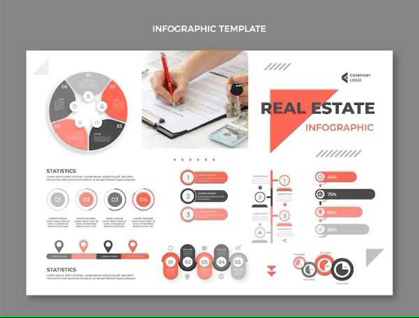
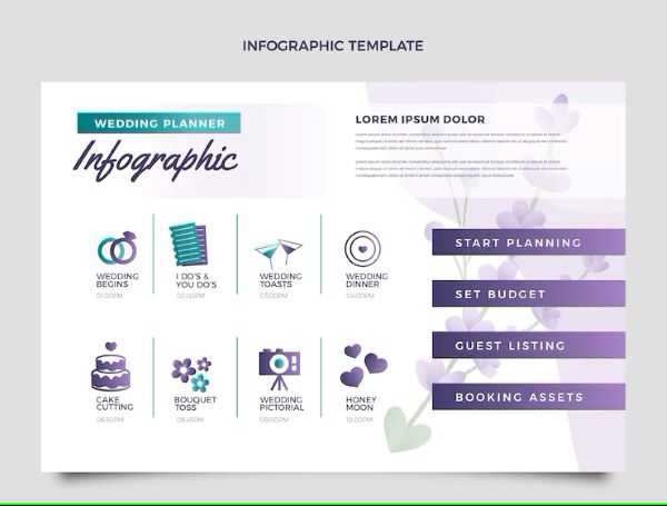
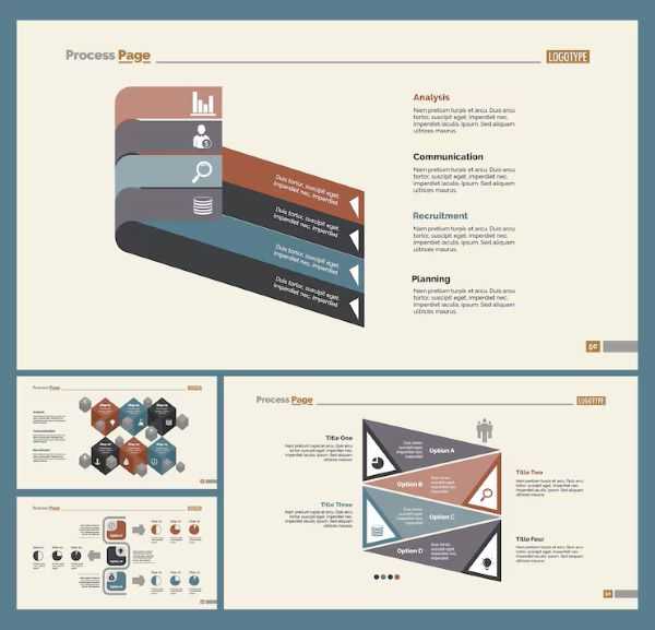
Infographic-style slides provide a powerful alternative by transforming complex information into visually engaging, easily digestible content. If you’re presenting data, telling a story, or explaining a concept, infographics can elevate your presentations to new heights.
This article guide will walk you through the principles of infographic design, the key elements to consider, and best practices for presenting visually appealing slides that leave a lasting impression.
1. Simplify Complexity
Visuals break down complex concepts into easily digestible chunks. Instead of overwhelming your audience with blocks of text, infographics streamline information, making it clearer and more accessible.
2. Boost Engagement
Visually appealing graphics capture attention and sustain interest. When designed effectively, infographic slides create curiosity and encourage active engagement with the content.
3. Enhance Recall and Retention
Our brains are wired to remember visuals better than text. Presenting data through charts, graphs, and icons makes key messages more memorable, increasing the likelihood of retention and recall.
In today's fast-paced world, capturing and retaining audience attention is more challenging than ever. Traditional slide decks filled with text-heavy content often fail to make an impact.

Key Elements of Effective Infographic Design
To create impactful infographic-style slides, consider the following essential design elements:
1. Strong Theme and Narrative
- Define a clear topic and message.
- Ensure all design elements align with the central theme.
- Use storytelling techniques to guide the audience through the information seamlessly.
2. Visual Hierarchy
A well-structured visual hierarchy directs the audience’s attention naturally. Utilize:
- Size: Larger elements emphasize importance.
- Color: Highlights key information and improves readability.
- Positioning: Logical arrangement ensures smooth flow from one point to the next.
3. Data Visualization
Transform raw numbers into compelling visuals:
- Use bar charts for comparing categories.
- Choose pie charts to illustrate proportions.
- Apply line graphs for trends over time.
- Implement scatter plots to show relationships between variables.
4. Strategic Use of Color
Color is a critical design tool that enhances comprehension and emotional impact:
- Use contrasting colors to highlight essential points.
- Stick to a consistent palette to maintain visual harmony.
- Consider accessibility by ensuring sufficient contrast for readability.
5. Typography that Enhances Readability
- Select clean, easy-to-read fonts.
- Establish a font hierarchy with different sizes and weights.
- Avoid excessive font styles to maintain a professional appearance.
Choosing the Right Data Visualization
One of the most powerful applications of infographic slides is the ability to represent data visually. However, selecting the wrong type of visualization can confuse rather than clarify. Here’s how to choose the right chart for your data:
- Bar Charts: Best for comparing different categories or showing trends over time.
- Pie Charts: Useful for illustrating proportions and how parts contribute to a whole.
- Line Charts: Ideal for displaying data progression and identifying patterns.
- Scatter Plots: Effective for revealing correlations between two variables.
Always ensure that the chosen visualization aligns with the data’s purpose and makes the insight clear at a glance.

Typography & Color Palette Considerations
Typography Tips:
- Font Selection: Choose fonts that are readable and align with your theme.
- Font Hierarchy: Use varied font sizes and weights to create structure and emphasis.
- Avoid Clutter: Stick to 1–2 fonts to maintain a clean and professional look.
Color Guidelines:
- Color Harmony: Select a palette that complements your theme.
- Contrast for Readability: Ensure text stands out against the background.
- Consistent Styling: Maintain uniform colors for related elements to enhance coherence.
Crafting Compelling Headings and Captions
Strong headlines and captions play a crucial role in enhancing infographic slides. They should:
- Be concise yet descriptive.
- Provide clear context for accompanying visuals.
- Offer actionable insights that add value to the audience’s understanding.

Incorporating Imagery and Icons for Maximum Impact
Adding relevant visuals helps reinforce your message. Consider the following:
1. Illustrative Icons
Icons can replace lengthy text descriptions, making information quicker to absorb. Ensure icons are:
- Simple and universally recognizable.
- Consistently styled for a cohesive look.
- Used sparingly to avoid clutter.
2. Relevant Imagery
Choose images that:
- Directly relate to your message.
- Enhance understanding rather than serve as mere decoration.
- Maintain a consistent visual style with other elements.
3. Consistency in Visual Style
To ensure professionalism:
- Stick to a uniform illustration or photography style.
- Avoid mixing too many different design aesthetics.
- Ensure alignment with your overall presentation theme.
Best Practices for Presenting Infographic Slides
Creating well-designed infographic slides is only half the battle; delivering them effectively is equally important. Follow these best practices:
1. Keep It Concise
- Avoid information overload.
- Limit text and let visuals do the talking.
2. Highlight Key Points
- Use bold, color, or size differentiation to emphasize essential takeaways.
- Summarize insights succinctly.
3. Use Transitions Effectively
- Introduce elements progressively to guide focus.
- Avoid excessive animation that can distract from content.
4. Engage with Your Audience
- Maintain eye contact and use storytelling techniques.
- Encourage interaction through questions or discussions.
Infographics transform presentations from static, text-heavy slides into dynamic visual stories. By implementing the principles outlined in this guide, you can create compelling, easy-to-understand slides that captivate your audience and drive your message home.
Start designing today and watch your presentations come to life!
Author Bio
Writer comprises full-time and freelance writers that form an integral part of the Editorial team of Hubslides working on different stages of content writing and publishing with overall goals of enriching the readers' knowledge through research and publishing of quality content.
Article Comments
No Comments!
At present there are zero comments on this article.
Why not be the first to make a comment?
Similar Articles
Sponsor
Search Articles
Experts Column
Latest Articles
Featured Articles
Most Popular Articles


