Minimalist Presentation Design: Less Is More

In presentation design, less truly is more. Minimalism focuses on simplicity, using fewer elements to communicate a clear, powerful message. This approach ensures that key ideas are not lost in a sea of distractions.
The core principle of minimalism in presentations is to strip away unnecessary details. This includes avoiding overcrowded slides, excessive text, and overly complex graphics. Instead, focus on concise, impactful content paired with clean visuals that enhance your message.
This article explores the principles of minimalist presentation design and how you can apply them to captivate your audience and deliver your message with precision.

The Power of Simplicity
A minimalist presentation prioritizes clarity and focus. By removing clutter and distractions, your audience can better absorb and retain key information. A clean, streamlined design strengthens your message and improves comprehension.
The mantra "less is more" lies at the heart of this approach, emphasizing the power of stripping away the unnecessary to highlight what truly matters. Using a minimalist design can create presentations that are not only visually appealing but also more impactful and memorable.
1. Typography
- Sans-serif Fonts: Fonts like Helvetica and Arial enhance readability and maintain a modern appearance.
- Consistency: Use a maximum of two font styles to create uniformity and avoid visual clutter.
- Legible Sizing: Ensure text is large enough to be easily read from a distance.
2. Storytelling Over Slide Density
Rather than overcrowding slides with information, structure your presentation as a compelling narrative:
- Clear Flow: Establish a beginning, middle, and end to guide the audience seamlessly.
- Visual Reinforcement: Use imagery strategically to support and enhance storytelling.
3. Decluttering Your Slides
- Reduce Text – Keep wording concise and meaningful. Use bullet points and clear headings to structure content effectively.
- Limit Visuals – Select a few high-quality images rather than overwhelming slides with too many elements.
- Simplify Design – Stick to clean shapes, simple fonts, and a cohesive color palette for a polished, professional look.
4. Crafting Impactful Visuals
- High-Resolution Images: Use crisp, professional visuals that complement your message.
- Purpose-Driven Graphics: Choose simple, clear visuals that enhance understanding rather than distract.
- Limited Color Palette: Stick to a consistent, well-chosen set of colors to maintain cohesiveness.
5. Effective Use of Space
- White Space Matters: Avoid cramming slides with too much information; embrace simplicity.
- Balanced Layout: Arrange elements thoughtfully to create visual harmony and direct attention.
- Clarity Through Breathing Room: Use negative space to separate content, making it easier to digest.
6. Engaging Your Audience with Simplicity
- Pacing and Pauses: Let key points stand out by controlling slide progression and allowing moments of reflection.
- Subtle Animations: Use simple effects, such as fades, to emphasize content without distraction.
- Accessibility Considerations: Ensure high contrast, readable fonts, and colorblind-friendly design for inclusivity.
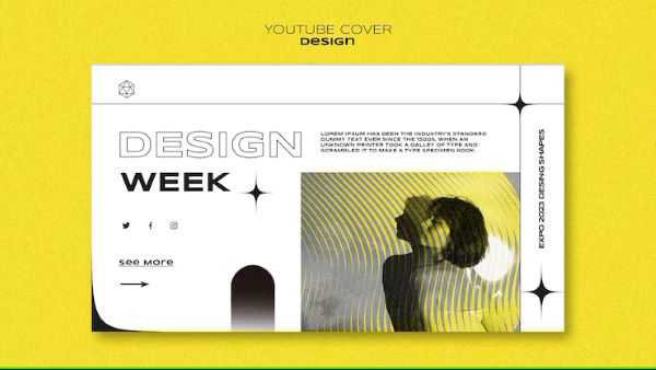
Use white space strategically to create a balanced design that guides the viewer’s eye to the most important elements.
Opt for simple, readable fonts and avoid using too many colors or fonts that can overwhelm the audience. For visuals, choose high-quality images or icons that directly support your message.
Minimalism also enhances focus. With fewer distractions, your audience can easily follow the narrative, which is particularly important for conveying complex business ideas or financials. When you remove visual clutter, you allow your message to take center stage, making it more memorable and impactful.

The Benefits of Minimalist Presentation Design
A well-executed minimalist presentation enhances:
1. Enhanced Clarity
A minimalist approach removes unnecessary distractions, ensuring the core message stands out. With less clutter, the audience can quickly grasp the main points without being overwhelmed by excessive text or visuals.
2. Better Audience Engagement
Simple, well-structured slides keep viewers focused on the speaker rather than trying to decipher a complex slide.
A clean design creates a more professional and polished look, maintaining audience interest.
3. Improved Readability
Using fewer words and larger fonts makes information easier to read, even from a distance.
Simple color schemes and clear typography prevent visual fatigue.
4. Stronger Visual Impact
Strategic use of white space (empty areas on the slide) enhances visual balance, drawing attention to key elements.
High-quality images, icons, and simple graphics stand out more effectively when not competing with excessive elements.
5. Easier Retention of Information
People process and remember visuals better than dense blocks of text.
A minimalist design ensures that each slide conveys only essential information, making it easier to recall.
6. More Persuasive and Professional
A clean, structured layout gives a sense of confidence and credibility.
Busy slides can make a presenter seem unprepared or lacking focus, while minimalism signals professionalism.
7. Faster Slide Creation & Flexibility
Minimalist slides take less time to design since they avoid unnecessary embellishments.
They are adaptable to different presentation formats, whether in-person, virtual, or mobile-friendly.
Minimalist presentation design isn’t just about aesthetics it’s a powerful tool to improve clarity, engagement, and retention.
In conclusion as you embrace the "less is more" philosophy, you’ll find that your presentations become more engaging, more professional, and ultimately more effective. So, the next time you prepare a presentation, take a step back, simplify your design, and let your message shine through. After all, in the art of communication, sometimes less truly is more.
Author Bio
Contributor comprises full-time and freelance writers that form an integral part of the Editorial team of Hubslides working on different stages of content writing and publishing with overall goals of enriching the readers' knowledge through research and publishing of quality content.
Article Comments
No Comments!
At present there are zero comments on this article.
Why not be the first to make a comment?
Similar Articles
Sponsor
Search Articles
Experts Column
Latest Articles
Featured Articles
Most Popular Articles


